From its lettering to its colour scheme, the NHS brand is widely recognised across the world. Robyn Quick investigates what makes it so iconic, and whether it will ever change.
When someone enters an NHS healthcare space, one of the first things they will be greeted with are white and blue. These are, after all, the instantly recognisable colours of the national health service.
They can be seen in every building under the NHS’ care, from neonatal wards to hospices. In a survey conducted by the NHS Identity Team in 2016, they found that virtually all (98 per cent) of respondents recognised the logo. Nearly two-thirds of those in the survey said when they saw the NHS logo on information, it created a more favourable impression of the services offered.
This is indicative that the NHS branding is deeply ingrained in the public consciousness. For many, it embodies trust, quality and accessibility in healthcare.
But those iconic colours have not always been associated with the health service. We dig into how the NHS branding came to be, as well as exploring the world of signage in healthcare today.
In the beginning
When the NHS was founded in 1948 by Nye Bevan, there was actually no official branding for the health service. Not even the acronym ‘NHS’ was in regular use until later on. There were a variety of different colours and logos used before the NHS identity was firmly associated with the brand we know today.
The old iconography for the health service is rather tricky to come across, but there were reports that at one point the NHS was using a red cross to symbolise the brand. However, due to the simplicity of its design, the NHS said any type of red cross could easily be mistaken for the protected red cross emblem so it was discontinued as a logo.
The lack of branding early into the health service’s existence may well be down to the fact that the NHS was not considered a uniform brand, but that all changed just before the dawn of the millennium.
The re-brand
In 1999, the NHS Identity Team was created to bring 600 brands and sub-brands together to create one corporate identity.
The NHS Identity guidelines are based on six overarching principles which provide the strategic direction for the use of the NHS Identity and create a framework to ensure all current and future decisions about the NHS Identity are consistent.
These are: compassion, respect and dignity, improving lives, commitment to quality of care, working together with patients and caring for everyone.
This identity change came as the Labour Party aimed to move away from a healthcare model that aimed to treat people on an illness-by-illness basis and towards a system that can handle complex needs that require cross-departmental organisation.
It replaced the internal market with 481 Primary Care Groups, which were to operate under a unified NHS Identity.
This is when the signature background blue (Pantone 300 for all the colour nerds out there) rectangle and white logo with the Frutiger font came into the public sphere. The logo is also known as the blue-and-white ‘lozenge’ and is used across the NHS to this day.
The lozenge was used as early as the 1990s, but it was made official a few years later to ensure the entirety of the health service appears organised and uniform.
The NHS refers to it as a “visual representation of the values and purpose of the NHS – a national service, accessible and free to all.”
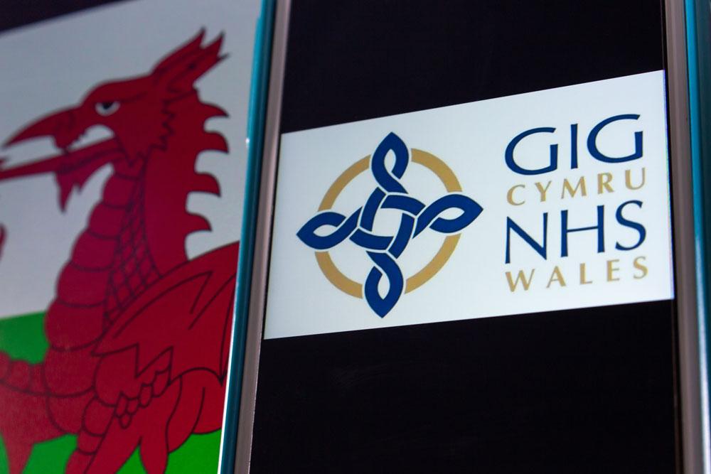
NHS Scotland has a different logo, in which a blue symbol somewhat similar to a seagull is placed below the acronym. In Wales, a more complicated logo is used featuring an intricate emblem and a gold-and-navy colour palette.
Signage
Today, there are specific rules on the specifications of how NHS signs can be designed and branded.
For example, the NHS blue and white must be used as the predominant colours for exterior signage because patients and the public strongly associate them with the NHS. If a number of NHS organisations are equally using the same premises, a single NHS logo should be used.
Signage should be as clear and simple as possible, making sure to make it as accessible as possible for people with a disability, impairment or sensory loss.
Why so blue?
We all associate blue with safety and trust, but often without even realising it. This is partly why when the NHS announced 27 new scrub colours for clinical staff at the end of 2023, most of those colours were just variations on blue with the odd inclusion of green and grey.
Other colours are allowed to be used in NHS signage and branding, but they are to be used sparingly. Let’s use red as an example.
It is generally confined to emergency healthcare, such as A&E departments or ambulance services.
Instead of the apparent calmness that the colour blue creates, red can represent an urgency necessary for an emergency setting.
But why are blue and white the principal colours used in all of the NHS branding?
Dr Helen Thompson-Whiteside, associate professor in marketing and society at the University of Portsmouth, said the brand’s “incredibly simple” style is why it is so successful.
She said: “Blue is a calming colour that represents things like the sky and the sea; these are universal to everybody.” Dr Thompson-Whiteside went on to say that the white represents purity, hygiene, and cleanliness.
She added: “The lettering is incredibly simple and easy to read, drawing on those colour associations.
“It hasn’t been mucked about with, it has a consistency that a good brand should have which makes it trusted and recognised.”
Controversy
The iconography of the NHS has been relatively untouched by controversy, but there have been some incidents throughout the years.
For example, in early 2017, every hospital in England was asked to rework all their publicity materials to change the position of the NHS logo so that it sat above the name of each hospital instead of beside it.
This prompted fury from patients and NHS staff, as it would have required an uphauling of all of the signs for what could be argued as very little pay-off.
The future Despite a few bumps along the way, the general consensus regarding the logo is a positive one.
Dr Thompson-Whiteside added: We are living in a post-Covid world, where healthcare and vaccines were at the centre of everyone’s lives for such a long time.”
She said that this difficult period “renewed our trust” in the brand.
“It could change in the future, but this brand is a point of reference for a nation of people.”
Dr Thompson-Whiteside said if it were to change at all in the future, it would most likely be small tweaks over time that most of us do not notice. It would be more than just changing some lettering, she said.
“People would ask themselves questions like: ‘Can I trust this service?’ ‘Does it hold the same values?’”
It looks like the NHS brand is here to stay as a global symbol of our identity.